Thoughts on “Julia” – A New Time-Lapse Video on YouTube.

To receive a complete list of the drawing materials I used to draw this portrait, just subscribe to our mailing list using the form below. It’s free!
Last week I published another time-lapse video to YouTube. You can watch it here, or you’ll find it embedded at the bottom of this post. This one features a drawing of my niece Julia, which I made as a gift for my sister, Julia’s mother.
For this YouTube video, and for the next several that I publish, I’d like to discuss some of the unique challenges I encountered while working on this portrait. Every drawing is different, after all, and so are the problems they present for an artist to solve. My hope is that this kind of post-game reflection might be helpful for those looking to improve their own drawing skills.
Aside from the usual problems of drawing a portrait – like achieving a likeness – which are the same in every case, I encountered three areas of difficulty when developing this drawing in particular.
That Hair!
With respect to her hair, Julia hit the genetic lottery. She’s been blessed with copious locks of dark, lustrous curls. No gimmicks, no products, it just looks like that when she gets up in the morning. When she puts it up, as it is in this image, she looks like she just stepped out of Jane Austin novel. It’s really beautiful.
But it also presents a drawing challenge on three fronts:
- Structure. There’s a lot of form and structure to deal with in Julia’s hair mass. Each curl has a unique shape, position and orientation on the head that must be considered, both to describe that particular structure faithfully, and describe it in a way that respects the overall roundness of the head. Locks of hair need to appear to wrap around the volume of the underlying skull or a strange flatness will result. This means I had to consider perspective, paying attention to how the shape of locks and groupings of hair changed on different parts of the head.
Of course, this is true when drawing anyone’s hair, but it’s often possible to generalize a little more – particularly on individuals with short haircuts. In Julia’s case, the length and “curliness” of her hair is an important part of the likeness, and the salient structures are numerous and complicated (spirals!).
All that said, I didn’t want the hair to distract from the face, which is arguably the true subject of the drawing. So while I wanted to be faithful to the structure of her hair, I also tried to keep it in “soft focus” and not get too picky about tiny details. That’s partly why you see me using a paper towel so often in that area. Describe, the soften. Describe, then soften. Over and over. - Value. Julia’s hair is inky dark and seems to absorb most of the light in the room, like a black hole. Much of the light we see reflected off her hair is confined to a few small areas of specularity, or “highlight”. This compresses the available value range for modeling the forms because there’s only a small interval between light and shadow side values, and makes describing the 3-dimensionality of the hair mass a little bit harder.
I’ve encountered this difficulty before, such as in my portrait of DaLawn a couple of years ago, but it remains tricky nonetheless. - Materials. The sheer darkness of Julia’s hair also presents a drawing materials challenge. Values that dark require a lot of work with the pencils, ratcheting down the value incrementally, which can be quite time-consuming.
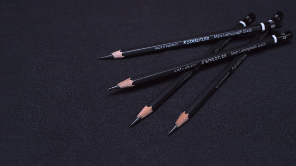
When such dark values occupy an area that large on the page, it can add hours to the execution time for the drawing overall. This took some extra patience on my part, and I ground through a lot of my Staedtler Mars Lumograph black pencils in the process – which is why I buy them by the box-full.

Kids!
The second big problem in drawing this portrait was in the description of the more subtle forms on Julia’s face. I’ve written about this before, but I find drawing children to be more difficult than drawing adults. This has nothing to do with kids being incapable of sitting still long enough even to take a decent photo reference, although this was definitely true in Julia’s case. She’s really fidgety and hates having her picture taken.
Instead, the issue is… well… fat. Baby fat, in particular. The faces of children are small, round and padded on the inside with lots of baby fat. This can obscure many of the sharper, bony structures that are more evident in adults: the edges of the eye sockets, the bottom edges of the cheek bones, the jawline in particular can all be obscured under a dense layer of fatty “cloud cover.”
And yet, they’re still there, exerting a subtle influence on what we see. In turn, the layer of baby fat on top of those structures has its own form characteristics – little bumps and breaks on the surface that tend to be very softly defined.
If you ignore this squishy topography, your drawing will end up looking like a mannikin (or a Cabbage Patch Kid – remember those?) But if you over-describe those things, your portrait drawing will look lumpy and weirdly aged. Instead, these characteristics need to be stated, but in a whisper. This takes a degree of subtlety and control with value passages that can be daunting.
Paper
Making this drawing was a new experience with respect to the paper. As many of our online students have learned already, my favorite drawing paper, Canford, in a color called “Dreadnought Grey”, is no longer available. It turns out that Daler-Rowney, the company that makes Canford paper, was acquired by Canson (another paper manufacturer) and they decided to discontinue the whole Canford lineup.
I hate it when corporate mergers make roadkill out of perfectly good products. But after my initial temper tantrum passed, I was pleased to find that Canson Colorline paper in a color called “Pebble Grey” appears to be a reasonable substitute, at least with respect to weight, durability and color.
Although I’ve used this paper before, this was the first extended portrait I’ve attempted with it, and while I still like it, it doesn’t offer quite the same experience as drawing on my beloved Canford. The main difference is that the “tooth” (or texture) of the surface is far less pronounced – in other words, Colorline paper is smoother. While this can have some advantages, smoother paper doesn’t quite “grab” and hold-on to drawing materials in the same way. It took me some time to get used to how graphite and chalk behave on this surface, which slowed me down and I’m still not quite sure how I feel about it. I’m keeping Colorline paper as an option on my teaching supply list for now, but I’m also considering alternatives. I really wish Canford paper was still available.
In the end, I had a good time drawing this portrait, as I always do, and I’m happy to share it with you now. Despite the precarious bits, I enjoyed drawing Julia’s hair, and I had fun with the texture of her dress and drawing her freckles (something I also discuss in our online portrait drawing course.) But drawing is never easy. At best, it’s equal parts work and reward. And in a way, the more difficult a drawing is, the greater those rewards can feel.
I hope you like it and that you enjoy watching the video. If you have any questions, please let me know in the comments below.
To receive a complete list of the drawing materials I used to draw this portrait, just subscribe to our mailing list using the form below. It’s free!


Thank you for your article, I really like portrait painting and I really like the way you paint portraits.
Thank you. 😀
Wonderful!
Amazing. Thank you for sharing as always!
Glad you enjoyed it, Alex.
The portrait video of Julia is another example of master class realism!
Thanks, Theresa!
Beautiful ! – just one criticism though, your drawing makes Julia look a little sad but in reality Julia looks happy as she sits for you in the studio – Julia’s hair in the drawing looks so real, so alive.
Thanks, Chris. As it turns out, Julia actually wasn’t so happy to sit for me, so maybe that’s why she doesn’t look it 🙂
David, you said “Aside from the usual problems of drawing a portrait – like achieving a likeness…” Could you comment about what are the usual problems and how to address them to achieve a likeness?
Well, that’s a big topic, Alan. I’m talking about the entire procedure of understanding what you see on the model and reconstructing it effectively on the page. Because all faces share certain characteristics in common, there are some problems to solve that are universal – each portrait presents slightly different versions of the same basic questions with respect to the shape and proportion of the head, the distribution of the features, perspective, etc.
Your skin tones are always spot on, but in your niece’s portrait, you made her skin luminous. As you developed her facial tones, she became visibly younger, just like in her reference photo. In your blog notes, you commented on how difficult children’s facial structures can be because of the underlying baby fat. I watched the video twice and you can see where you worked with all that in mind. Her under drawing made her look older, so your blog and video work very well to help us see what you refer to.
I would love if you keep doing the blogs after the portraits!
Thank you, Leslie. Those early markings are how I attempt to landmark some of the smaller lumps and bumps on the surface. They make her look older because they’re so stark and sharp. Part of the task in the value stage is to preserve the shape and position of these structures, while also softening and integrating them into the surrounding surface. Like many things in drawing, it’s a simple idea but difficult to do – or at least I think so!
Excellent as always! Especially loved the freckles.
Thanks, Foti!
Another beautiful drawing, and another beautiful viewing experience! Your work inspires me to “keep on keeping on” in my own artistic journey. Thank you for posting videos of your work process/progress. Also, thank you for these blogs, which I love just as much.
PS: I love this, “thoughts on the drawing” format! It makes the whole learning/viewing experience that much better for me.
Good to hear, Chris. I’ll try to keep this going!
Very nice demo. Thank you.
Thanks, Jacqueline!
This video was incredible, thank you for posting it. Weirdly, I found it very moving while watching it – I guess because I am passionate about drawing & I think I was a bit awestruck by it too! I have already signed up for the Vitruvian Studio online portrait drawing course, which I plan to dedicate time to soon. In the meantime, is there any quicker daily practice you can recommend to improve my accuracy of facial proportions? This is where my major weakness and stumbling block is, and I would love to be able to start getting a handle on it.
Thanks, Leah. Honestly, the best way to improve your accuracy in proportions is to do a lot of block-ins. Practice the early stages of drawing, where you make your initial decisions about shapes and their relationship to one another. Keep these drawings simple, generalizing curves into straight lines with corners (as discussed in the course). Spend an hour or so on one, then put it aside and start another. Repeat, over and over. Then go back to your earlier drawings, look for errors you can fix and fix them. It’s the repetition that will ultimately improve your ability.
Hope that helps.
Hello David,
Excellent blog, I felt your pain with the hair 🙂
You might be pleased to know that the paper is still available from some retailers in the UK. For example, https://www.pullingers.com/c/71858/canford-paper-a1-594mm-x-841mm. You might want to stock up 😉
Best regards,
Alpay Beler
Good to know about the paper, Alpay. I expect any remaining stock won’t last long! I’m glad you liked the post 🙂