3 Ways to Reduce “Graphite Shine” in Your Drawings.

I love drawing with graphite. Nothing beats the control and precision offered by a sharp graphite pencil.
But there’s one thing I hate about graphite: it gets “shiny” if you’re not really careful, and shiny drawings are ugly.
If you don’t know what I mean by “shiny”, grab a soft graphite pencil and a piece of paper. Fill a half-inch square on the page with the darkest value you can. Press hard with the pencil while you draw. Now look at the page from different angles. Depending on your angle of view, the square may seem inky dark, or silvery-grey, depending on how it catches the light. This is the dreaded “graphite shine”.
What’s happened here is that you’ve basically buffed-up the surface of the graphite under all that back-and-forth pressure with the pencil. This makes the surface of a drawing smooth and reflective, which produces glare and causes dark areas to appear light, effectively ruining the appearance of a drawing. This capacity to be polished is a natural characteristic of graphite – which is why some artists choose to avoid the material altogether.
There are ways to prevent your pencil drawings from getting too shiny, but they take some planning. To get started, you need to be aware of what’s actually causing the problem.
Graphite isn’t shiny.
The first thing to understand is that it’s not graphite itself that’s causing the problem. I frequently use graphite powder in my drawings, available by the jar, and it’s completely matte on the page.
The problem with graphite is that it can be polished, like silver. The process is called “burnishing” and it seems that the pencil point itself is a very effective burnishing tool – the back-and-forth motion of the pencil on the page will buff-up your drawing to a mirror shine, and flatten the “tooth” of the paper at the same time. The harder you press with the pencil, and the more you scrub back-and-forth with it while drawing, the smoother and shinier your graphite passages will become.
How to prevent graphite shine in a drawing.
In my experience, there are only 3 ways to prevent your pencil drawings from becoming burnished:
- Limit the amount of graphite on the page.
- Limit how hard you press with the pencil.
- Limit how many times you rework an area.
Let’s take these one at a time:
1) Limit the amount of graphite.
This may sound strange – aren’t we drawing with graphite pencils, after all? Well, yes and no.
In general, graphite pencils are available in two varieties: H’s and B’s. H pencils are harder and thus draw more lightly. B pencils are softer and thus draw more darkly. But graphite isn’t the only ingredient in pencil leads.
Graphite itself is a soft substance, so a very soft lead – like you’d find in a 6B pencil, for example – actually contains a high proportion of pure graphite. Harder leads – like you’d find in a 6H pencil – are harder because of the addition of clay. In other words, H pencils contain more clay and less graphite than B pencils.
Since graphite gets shiny and clay doesn’t, defaulting to harder leads is one way to limit burnishing in our graphite drawings. With less graphite on the page, we lessen the potential for future burnishing.
But what about darker values?
If we limit ourselves to hard pencils, however, we won’t be able to achieve robust darks – and that’s a big problem. Darker values are what make lighter values appear illuminated – we’ll sacrifice the sense of light and volume in a drawing if we can’t “go dark”.
There are two solutions to this problem. We could opt for graphite powder, applied with a brush or a rag, which can achieve relatively dark values without burnishing (unless, of course, you proceed to saw on top of it with a pencil).
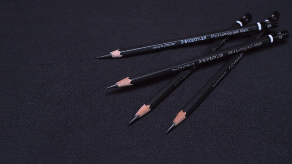
A second option is to use pencils with alternative dark pigments. Examples include the Staedtler Mars Lumograph Black pencils, which have a pigment (probably carbon black) added to the lead. This allows for rich darks with little burnishing. I use these pencils for much of the darker values in my drawings, and they work nicely. The Kimberly 9XXB is a similar option.
2) Limit How Hard You Press.
There are occasions where softer B pencils are just the ticket. The Staedtler Mars Lumograph Black pencils, for example, aren’t well suited for covering large areas efficiently – they contain a waxy binder that’s tough to spread around and manipulate with blending tools. A nice 4B or 6B pencil may be better suited… Just don’t press hard with it! Instead, build up the value gradually with two or three light passes instead of one heavy pass. This can be tricky, and switching between tools like the Staedtler Mars Lumograph Black pencils or graphite powder may be necessary to push the value dark enough.
3) Limit how many times you rework an area.
While you might get away with 2 or 3 light passes with a soft graphite pencil, drawing in the same area over and over again will eventually lead to burnishing. Such “overdrawing” is usually the result of choosing the wrong pencil to begin with. You may select a 2B for a given value and find it’s not soft enough. Then you try again with a 4B, and it’s still not soft enough. Then a 5B, and then an 8B, all the while pressing harder and harder to force the value down. This approach leads to the most egregious cases of shiny graphite.
Choose the right pencil for the job.
A better approach is to select the right pencil for the job to begin with, and thus limit the number of revisions that will be required. In my drawings, for example, I’ve learned to recognize the threshold of darkness where switching to a Staedtler Mars Lumograph Black pencil makes the most sense. This is usually somewhere around a Munsell Value 4, although the value of the paper you’re drawing on will also be a factor.
The best way to learn this for yourself is to experiment. Make a simple value scale, working from light to dark. Check for burnishing as you go, and when you start to detect shininess on the page, note what value you’re on and what pencil you’re using. Off to the side on the same page, try that value again with a different pencil selection and repeat until you find an approach that yields the least burnishing.
Ultimately, such experimenting is the best way to develop a command of your materials.
The Last Word on Graphite Shine.
Graphite’s capacity to burnish is a natural characteristic of the medium, and there’s nothing to be done about that. All we can do is try to limit burnishing by avoiding the behaviors that cause it – namely pressing too hard or too long with soft pencils and polishing-up the surface of the graphite.
That said, some amount of burnishing may occur despite our best efforts. Every drawing is different, and sometimes I find my drawings start to shine a little even when I’m being really careful about pencil selection and pressure. In those cases, I just accept that it comes with the territory and keep drawing. Minimizing shine may be the best we can do, but our drawings will still look better for the effort.
Do you have any further thoughts on graphite and how it’s best handled? Let’s discuss it in the comments below!


I’m a big fan of “Burnishing”. It’s okay to destroy the surface of a paper with a wire brush so that it can soak up more graphite. Don’t fear the carbon or the paper, you can put additional paper underneath a layer that’s become too thin or put additional paper on top of a section that you are not happy to be shown.
Just finished making a frame for one of my drawings and now that it’s up on the wall all I see is shiney eyes on my daughters face. Your post has been helpful to avoid this in future. Thankyou!
Thank you for sharing, it’s really helpful for me.
Love it 🙂
Many thanks for such a important . Excellent information
🙂
After reading I realized why my pencil drawings look ugly. Burnishing is the main factor.
I appreciate your way of explaining the art-related matters.
Thanks for the communication.
I will experiment with less pressure and will try the black pencils too. Thank you!
I tried an experiment the other day, with a Dixon Ticonderoga #2 and cheap copy paper. I laid down a dark area, which had a lot of shine, and then dabbed a bit of water on half of it and blotted it up right away with some facial tissue paper to keep the paper from getting too wet — and the shine there disappeared, with no value change when it dried. It seems the water raised the grain of the paper where it had been burnished from the pressure of the pencil. Worth playing with, I’d say.
I shall try this experiment and see if it helps!
Excellent information!!! Thank you so much. I will take your advice and create a value chart.
how about using a solvent? I’ve used my wife’s nail polish remover or turpentine. This blends the graphte without causing a shine
It is not commonly known that graphite sheen arising from using softer pencils (2B onwards) is also partly due to the addition of tallow (in most major brands) or synthetic oil (Faber Castell graphite pencils 9000 series). The concentration of fat or oil is directly proportional to the softness of the pencil [8B will probably contain more fat or oil than a 2B pencil). I have a blog post on the presence of fats in graphite pencils written from a perspective of a vegan scientist, I will be posting some experimental work in the near future: http://www.pencilandpaintmarks.com
Interesting, Shazia. I look forward to taking a look.
Finally an explanation and solution to the graphite shine. Very useful and well explained. Looking forward to more tips.
I’m glad it was helpful, Azzurre!
After reading I realised why my pencil drawings look ugly. Burnishing is main factor.
I appriciate your way of explaining art related matter.
Thanks for communication.
Many thanks for such a important and useful advice!
Alot alot thanks for your advice…
Love all the information! I love hearing about new techniques. Will definitely start incorporating this info. I usually rely on changing up direction of my stroke to build layers and volume-usually lots of crosshatch variations. I find the overall shine is broken up this way. I know though for some, they prefer having set directions for different parts of the drawing so it might not be an option.
Very instructive advice. I do quite a lot of drawing and experience this shine sometimes. I also know that a light coat of workable fixative will help to reduce the shine. I have also used carbon pencils in the very dark areas, thus eliminating the graphite shine altogether.
David,
your illustrations and tutorials are simply splendid. i am totally fascinated on the techniques you use. i do a lot of portraits using graphite and wondering how i can adopt your technique. i use the grid method and make it any size i want to. but your method is lot more effective. have to try out a few.
totally appreciate your tutorials.
best regards
Hello David,
I was wondering if you could tell me the best ways to apply graphite powder? It’s something I love to use but it’s tricky to get on the paper without creating an inconsistent tone. Also on a side note Staedtler have just changed their pencil formulations. The new 7B/8B/9B are all a graphite and clay mix. So people who previously loved the 7B/8B will have to swap to the new Staedtler Lumograph Black range which contain the graphite/clay/carbon mix
Thanks,
Sandy
Hi Sandy,
I usually apply the powder with a hog bristle brush and/or paper towel and gently massage it into the page with a broad circular movement. There will be some inconsistency, however, regardless of how you apply it because the distribution of the powder and the movement of your hand will naturally be somewhat irregular. To unify the value in any given area, you’ll need to work into it by adding into the light areas with your pencils and/or removing from the darker areas with a kneaded eraser or clean paper towel. Think of the graphite powder as a rough-hewn way to knock down the value quickly – which is useful for larger areas – but it’s not meant to be the final pass.
Yes, I’m aware that Staedtler has changed their product line, and thanks for the heads-up. They’ve also introduced 7H, 8H and 9H which are very helpful. I have yet to find time to re-edit this post and our courses to reflect these changes, but I’ll make those updates soon so everyone reading here will be aware.
As much as I love graphite, and their varieties of softs, and hards, I’ve been thinking of switching to charcoal which seems to illuminate the shine altogether when using graphite. Do you have experience with this medium, and if so, any tutorials? I work so hard on hard, and for so long on my portraits, but that maddening shine!! I just can’t seem to overcome it. What do you think? BTW, Love your awesome work!
Thanks,
JD
Charcoal is a wonderful drawing material with some distinct advantages over graphite – it can also be messy and difficult to control. As with any materials choice, there’s a tradeoff to be made.
I abandoned charcoal many years ago while teaching freshman life drawing at a college, and found that having 20 or so eighteen-year-olds all using charcoal together in the same room resulted in a huge mess – I’d come home with charcoal dust in my hair, in my clothes, and up my nose… so I switched to graphite pencils and never looked back. Graphite isn’t inherently “superior”, but it’s easier to control and doesn’t become airborne quite so easily, so I find it a good material for teaching. Plus, I just like it… But I encourage you to experiment with charcoal and see how it works for you.
Unfortunately, we don’t have any instructional material specifically about charcoal drawing.
Hi David
I live in Sydney Australia i am 60 yrs old and have followed my father in painting and sketching. I have been to a number of classes but never been satisfied as the teachers have never gone into
the depth of explaining the correct method and resolving issues with mediums. Today i thank god for the internet, and teachers like you, because for a few years i had stopped sketching and as i
have been following your tutorials it has sparked a new in site and desire to start up again. Word can not express the gratitude and the satisfaction i now have. I would also like to thank the
testimonials of other artists for their inputs.
Thanks again
Patrick
Patrick, that’s so nice of you to say. It’s always good to hear that what we do here matters to those looking to learn. Thanks for taking the time to tell us!
cretacolor nero pencils is not graphite, but go well with them. While they are not very shiny but not completely matte.
This is not for graphite “purists”, but I have been experimenting, and I have discovered that a Prismacolor pencil in black does not shine if not burnished by repeated strokes. It can be put directly over the darkest values of graphite. It does not blend well, however, after a drawing is mostly finished, I go over it carefully in small sections, making any needed corrections or adjustments. Then the very last thing I do is go over the darkest darks with the Prismacolor pencil. Of course, now I can’t truthfully say it is a graphite drawing, but I can call it a pencil drawing.
David just in the last few day I have been struggling with the same problem of shine, Looking through my pencils I found a Derwent Dark Wash 8b , it works well is this ok to use.
Hi David,
Honestly, I don’t know. I’ve not tried that particular pencil, but as a teacher of mine used to say: “If it works, it’s good.”
I was taught to build up layers in a drawing,starting with 2H and build up to darker values, being mindful of the tooth of the paper. This works for me and at the end, a good spray of fixative takes off any tiny bit of shine on my darker values. I’m really enjoying the blogs 🙂
Thanks for the input, Beverly. Sprays can reduce the reflectivity of the surface, although I find they also disrupt the values – particularly if you’re using white chalk for the lights. The spray will cause the chalk to sink-in to the paper, and greatly diminish it’s brightness. If you’re not using white chalk, however, spray fixative might be fine. I encourage you to experiment!
I wonder if larger areas of the darks in a drawing could be sprayed if other, lighter, areas of the drawing were covered.
Would it be worth the trouble to do that to lessen the shine?
I’m having too much fun with that, I am learning how to draw and english with your posts. Thank you for this and others will come.
Thank you for the input sir, I can really use the help.
I love your art, very much. Best regards.
Dear Mr David & Miss Malinda
Thanks for giving me an opportunity to join your community. I learned a lot by your material guide. I just wants to ask small question. When Blending stump had been used for some times, HOW TO SHARPEN THE POINT BECAUSE IT MAKES OUT OF PAPER?
Your guide lines are very useful to me.
Thank you
Donald
Hi Donald,
“Sharpening” blending stumps can be done with sandpaper in the same way you might sharpen a stick of charcoal. But remember… blending stumps should really be used gently. I’ve found that if they’re becoming “blunt” – i.e. the point has become rounded with use – it usually means you’re pressing too hard with the point and possibly damaging your paper. I use stumps for months at a stretch and they don’t loose their shape because a) I try to maintain very light pressure on the page with them, and b) I tend to use the side, or “shoulder” of the stump tip, not the point – the broader surface of the shoulder seems more amenable to the kind of softening that I want from a blending stump.
Hope that helps 🙂
David,Thanks for a superb article giving everyone a very rare opportunity to air their views on an important part of art.The correct reason for GRAPHITE SHINE is the fact that graphite IS shiny because graphite is made up of PLATELETS which when applied to paper lie flat and automatically form a MIRROR.On the subject of charcoal and carbon the reason the do not emit shine is the make up of these is different to charcoal in that the particals are nobbly and reflect light in many directions,so it still looks flat without shine.Please note that a graphite drawing should never be referred to as an graphite drawing if the artist has used other costituants in the drawing,because it is not.Graphite should always be applied VERY gently on any type of paper regardless of tooth or lack of tooth.Pressure is not the way to get darks Sorry to be so long winded but I feel strongly about the amount of miss information put out as fact goes unchallenged and then wrong techniques are applied to fix an imagined problem.The simple solution seems to me that you either don’t use soft B pencils in your works of art until you have worked long and hard to obtain the skill required or you use one or some of the afore mentioned pencils, but the best way is to keep experimenting until you find the best way for you.WORK WORK WORK.Thanks for the opportunity to have an input.Kindest regards,Paul.
Thanks for contributing, Paul. You’re absolutely right about the flat shape of graphite particles. We actually cover the difference between graphite and charcoal at the microscopic scale in our Drawing Basics course, so I’m glad to know you concur.
This post and subsequent comments have been very valuable to me. Thank you. I am just setting up to draw a life-size (from waist up) 5 figure family portrait. I have drawn for many years and am always on the lookout for good advice. I will get the Staedtler 7B and also the Kimberly 9XXB for my darks. I’m also going to try the Palomino Blackwing 602 in a future drawing.
Glad to hear it, Kent 🙂
Dear David,
This blog is wonderful. I read every comment and was interested in the paper preference people have in working with this medium of graphite. I understood all the comments on tooth of the paper, and I was it almost seemed like your portraits were being done on paper like Bristol board or canson paper. Also is the paper pure white or with a grey tone. I’d love to hear your experiences and experiments on paper choices.
Thanks
Mary Petricone
Weeki Wachee FL
I am using the marvelous Palomino Blackwing 602 in my Lawrence King sketchbook at night. Many many layers, dark tone and no shine!
Cool! Thanks for the endorsement, Anne! I look forward to trying it out 🙂
[…] I found a nice list of tips for using graphite in drawing this morning – check out the article here. […]
Dave, It’s great that you keep past students updated. I always look forward to your next project. All the best!
David, Thank you for the great info. That piece was packed with valuable tips. Thanks.
You’re welcome, Jim. Hope you’re doing well!
Great Blog David!! Thank you for sharing!
Thanks, Tony!
Very interesting discussion. Thanks for the knowledge. A couple of comments and a question.
A few years ago, a good artist who was leading a workshop recommended a technique of rapid, multi-directional hatching with a light touch for developing darks. “Don’t press harder, just keep going over it lightly to make it darker.” Have found that the light hatching resolves into a consistent tone, enabling subtle value changes, without getting shiny. And then in spots where you want to leave it loose you get a certain freshness of line and tone together, nice if, for example, fading from dark to light. One weakness to this is that I don’t get really dark darks, so I plan on trying the Staedtler 7B/8B as well.
Paper is important here — I especially like Stonehenge papers with graphite. Others as well, with a certain amount of tooth to the paper.
By the way, for a different sort of drawing — a more sketchy, gestural style — I sometimes use the fat Lyra Graphite Crayons (graphitkreide), which are a lot of fun. I mention this, because I read somewhere that the Lyras also contain an extra non-graphite black element (maybe just the 6B), and I think this may be true. I wonder if anyone else has experience with these.
Jim, you’re right that paper can have an impact. Paper that’s more “toothy” can do a lot to disrupt the surface of what would otherwise be smoother, shinier graphite passages.
The approach you describe to applying the graphite may well work. I’ve not had a lot of success with it personally, but there are a lot of variables – softness of the lead, direction of the stroke, sharpness of the point, pressure, tooth of the paper, etc… Experiment and do what works best.
I’ve not had experience with those Lyras, but I’ll look for them – they sound promising!
Thanks for the tip about the Lyra Graphite Crayons. I have bought regular Lyra pencils for drawing but didn’t know about the 6B containing a non-graphite element. All the best to you.
Thank you very much for your valuable advice … Frankly I do not use very pencil for my work … I love to work more directly with a pen … but I will try to implement the suggestions, also taking the interventions of other artists I read very carefully. See you soon MarioM
Thanks, Mario.
Hi David
I wish you much luck in your future work…
Thanks for the wonderful advice.
Best ,best regards:-)
Twitter: @mungosi
Sasha Marjanovich Mongoose
Many thanks for your generous lessons David. I’ve avoided graphite pencils for certain types of drawing because of the tendency to shine and instead use Wolf’s carbon pencils which don’t produce a shine. You suggest that the Staetler Mars Lumograph 7B and 8B probably contain carbon hence the lack of shine and achieve a deep dense black. Why, then, would you not use carbon pencils for the complete range of values?
Would you care to comment?
DesB
Des, I’ve avoided carbon pencils for the same reason I don’t use charcoal – I find them too messy. But that’s just me – obviously there are plenty of examples of beautiful drawings done with charcoal and carbon pencil. If you find carbon pencils suit you, keep using them! You’re certainly right about the dark values they can achieve.
muchas gracias por la informacion, un saludo
You’re welcome, Dioni.
I don’t care so much the shiny in graphite drawings because you can see the shine looking at the paper 130 degrees or something like that, an everybody see the drawings at 90 degrees with a zenithal light (except if you take a picture with flash). However, after apply the graphite, I varnish the drawing and then I use a hard charcoal (General’s HB charcoal is like 7B lumograph graphite pencil after some tests I did). Obviously it is necessary to varnish the drawing before because the charcoal slides over graphite layers as you know.
Good to know, Daniel. Sounds like it’s worth a try 🙂
How do you varnish the drawing?
Beth, I don’t use any varnish, or fixative or any other kind of spray because they influence the values too much. Typically, spray-on coatings will make values darker, particularly if you draw on toned paper with white chalk. The spray being fluid, it seems to dissolve the chalk and carry it down into the tooth of the paper, resulting in less opacity and less brightness.
If you’re looking to protect your drawings, I find it better to store them securely in some kind of flat file, or in a frame under glass.
Thanks for the information David. It’s key to know and understand our materials. I have found that with practice, these principles eventually become second nature, and therefore allows the artist to concentrate more on compositional elements. Again, thanks for the info and a great website!
You’re welcome, Steve! You’ll get no argument here… Practice is key.
In traditional academic drawing we achieve the darkest values with a 2B pencil and an extremely sharp pencil, almost need like. You polish it , meaning fill the gaps with an HB then an HB pencil with the same sharpness. No shine, doesn’t matter how many times you re-work an area as long as you have a light touch.
Point taken, Santiago – no pun intended 🙂 You’re right that a sharper point can reduce burnishing substantially – and I’m an advocate of keeping your pencils sharp while drawing.
There are two reason why I find the approach problematic, however. One is that the kind of point you’re talking about, known as a “spear point” is both time-consuming to make and extremely delicate to maintain – I find they break easily and often, and you’re back to sharpening yet another spear point.
The other reason is that deploying the graphite in such a deliberate manner, while admirable in the focus and discipline it requires, is simply too time-consuming – at least for me. As my wife will verify, I take way too long to complete my drawings as it is – I don’t need anything else to slow me down further!
I know there are many artists who use this method to draw beautifully… I’ve chosen to offer a different solution to a very common problem in pencil drawing. Thanks for the input!
I couldn’t agree more Santiago! 2B is more than sufficient if the right technique is used for a drawing. I tend to sharpen my pencils with a knife and get a really sharp point with sand paper. For a really sharp, dark lines I don’t even go softer than F.
@David: If the so called ‘spear point’ snaps that automatically means that there is too much pressure on the tip. Pressure also means burnishig leading back to the problem of shine.
Another option is a mechanical pencil. A few months ago I discovered the Uni Kuru Toga Roulette (which automatically rotates the lead and I love it (although I tend to go back to the knife/sandpaper method for traditional pencils).
About the mentioned blenders….blenders also lead to the problem of a shiny drawing. That’s why we never were allowed to use it in my academy 😉
But what I also find is that the paper matters a lot!!! On a heavy, high quality paper I can re-work way more and build way more layers than on cheap paper.
Kind regards,
Thanks for chiming in, Ankat. I’m familiar with mechanical pencils and use them frequently. I’ve not tried the model you mention, but one of my prized possessions is my TruPoint rotary lead pointer, which keeps a 2mm pencil lead atomically sharp. I’ve actually blogged about it here.
And yet… I’ve not found that a 2B pencil, even if honed to a razor sharp point, is quite the right solution for me.
I, too, was originally taught to draw with spear-points – and was also forbidden to use blending tools – but I found the approach inadequate for producing sufficiently dark values. That, and the ponderously slow pace of deploying graphite one molecule at a time led me to investigate alternatives.
My experience with blending tools has been entirely positive – once I got over my initial fear of them. Years ago, some of my early instructors convinced me that using blenders brings ruin to drawings, but with experimentation I’ve found the opposite – using them with care, and under strict conditions, can yield beautiful results… But that’s material for another blog post 😉
Some of the best advice I ever received from a drawing teacher came from the late Deane G. Keller. One of his mantras was “If it works, it’s good.” What he meant was that as artists, we should employ the methods that work for their intended purpose, even if those methods are unorthodox. It was his way of defusing arguments about what’s “correct” or “authentic” in studio practice. Deane was the teacher who encouraged me most to investigate alternatives to what I was “always” taught, and I’ll forever be grateful for that.
In any case, that pencil you suggest sounds great. I look forward to trying it!
What about a using a fixative at the end that tends to act like smoked / etched glass by diffusing the surface a little bit?
Douglas, fixative does help reduce the reflectivity after the fact but it can play havoc with your values – particularly if you use white chalk on toned paper. Fixative tends to dissolve the chalk and carry it down into the tooth of the paper, making your lights much dimmer.
This sounds right to me, but isn’t there a problem mixing different types of pencils with graphite? I was always told you can’t do that.
It depends on the type of pencils you’re mixing, Joseph. Trying to mix charcoal and graphite together doesn’t work very well, for example, but the Staedtler Mars Lumograph pencils I reference here are made to be used together with graphite pencils – they’re part of a graphite pencil product line, and they’re included in graphite pencil sets.
They play nice with graphite because of a binder mixed-in to the lead, which causes particles graphite and pigment to “stick” together – at least, that’s how I understand it.
Does the type of paper have anything with the shine?
The paper can make a difference,Joanna. Paper with a pronounced “tooth” (another word for texture) can help camouflage any burnishing as it scatters the light that reflects off the drawing more diffusely. Highly textured paper, however, can make achieving uniform values more challenging.
Thicker, stiffer paper might also help, as the tooth may be more resilient against the downward force of the pencil. If the tooth of the paper collapses under pressure from the pencil, it will yield a smoother, and thus more reflective, surface. This is another reason to limit your pressure with the pencil while drawing.
youre works are excellent can you help me to study your art